My Biggest Home Theater Mistakes Page 3
 |
| Photo by Phillip Ennis |
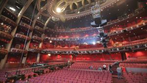
WrongThis theater in Northern Connecticut, designed in the traditional style, uses too many clashing colors.The color scheme makes the room look gaudy and unsophisticated. |
MISTAKE NO. 2
Using color without restraint.I was recently on a business trip to the town of Chang'an, in the south of mainland China. I will never forget the vulgar color scheme of a rather upscale restaurant my hosts took me to. Everything there that wasn't painted bright red was either green or black or yellow. And for accent, gold paint by the gallon was used everywhere. That restaurant reminded me of a theater in Northern Connecticut that I'd designed in the early '90s. The excessive color on the walls, the ceiling, and the carpet gave the theater a cartoonish look.
Color needs to be used with discretion. It's usually okay that the fabrics for the seats, the curtain, and the wall upholstery have some color to them, but it's best that everything else be rather muted. What gives a theater character, distinction, and sophistication is the right balance between color used sparingly here and there and the muted tones of the remaining surfaces. When a client complains that the carpet color might be too dull or that the walls are too monochromatic, all I have to do is show them a photo of that theater in Connecticut. That's usually enough to make them think twice before ruining their own space, too.
 |
| Photo by Phillip Ennis |
RightThis very traditional theater in Florida is opulent, with an abundance of decorative elements. Although it has a rich color palette, the sophistication of the color scheme prevents it from coming across as too loud. |
- Log in or register to post comments


