Ask Theo: Less is More
Before I get to my first critique of reader's home theater, let's make sure we're all on the same page. This column is not going to be about electronics. There's plenty of that going on elsewhere on this site. Here I will be talking about the effort to integrate electronics into the look of a room dedicated to watching DVDs, Blu-ray Discs, or HDTV.
In other words, this column will be primarily about design. And because a picture is worth a thousand words, finished rooms shown in photos will have a better chance of being discussed here than rooms that are still in the drawing stage. I selected this month's entry mainly because I was able to see what the room looked like. It's also a good example of what most people do when they create a home theater without professional help. Well, we all know that you can't tell a designer what to do or not to do without ruffling his or her feathers (and that includes me). But you can't learn from your mistakes unless somebody points them out, so I'm going to go ahead and tell it to you like it is.
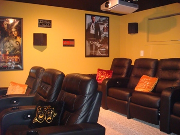
Our first submission comes from Kurtis, who described his theater as a "modest do-it-yourself job" when he sent in his photos.
Kurtis: For a do-it-yourself theater, your space isn't bad at all. The seating seems comfortable, there's a nice contrast between the color of the chairs and the walls of the room, and the stage area is treated with the kind of feature that every stage deserves but doesn't often get: a curtain. My only criticism is that you've created a distraction by having too much on or against the walls: posters, speakers, Dolby and DTS signs, a storage cabinet, and so on. You need to reduce the clutter.
I know, I know: A poster display is what we all associate with going to the movies. But how many theaters have you been in where the posters are inside the main auditorium instead of in the lobby? The temptation to hang stuff on the walls in a home theater is irresistible because most people - except for the determined minimalists among us - are scared of empty space.
If I were you, I'd first take down the posters and the other signage. Then I'd mount the surround speakers against a fabric-wrapped, almost floor-to-ceiling-high acoustical panel (no more than 12 to 15 inches wide). Then I'd add two more similar panels per wall, with the three on each wall evenly spaced between the back and the front of the room. If you do that, you'll notice that the side speakers won't look intrusive anymore because they'll be anchored by design against the fabric panels.
And the panels will add some decorative flair to the room - which will be welcome when the posters are gone. They might even help the room acoustically. Just make sure to keep the color of the fabric as close to the wall color as possible, except two to three shades darker.
I've seen much more elaborately designed rooms fall flat on the face of their ambitions. You kept your space simple, and with a little more effort, it can be both simple and elegant.


