Sony VPL-VW60 SXRD Video Projector Real-World Performance
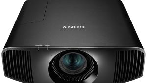
I've been living with the Black Pearl for weeks now, and it hasn't worn out its welcome. It does so many things well, with so few flaws, that it's hard to know where to start.
So I'll start by listing the problems...give me a second...oh yes, neither of the two Color Space menu selections, Normal or Wide, is particularly accurate (a common shortcoming in consumer displays). On a color-bar pattern, the differences in the two modes were quite visible—and measurable.
On real program material, however, the differences between the Color Space settings could be subtle. But not always. I could certainly see the distinction in the reds on such items as the London phone-booth "entrance" to the Ministry of Magic in Harry Potter and the Chamber of Secrets and Lightning McQueen's deep red color in Cars. In Normal mode, the car was distinctly orange, while in Wide mode, it was almost cherry red. But on most material, Normal looked closer to "right" and less, um, cartoonish.
The red, green, and blue primary images were not equally well focused. Green was the sharpest (a good thing and probably not accidental, considering the eye's sensitivity to green), and red was the worst.
Despite this difference in color focus (which I discovered inadvertently while playing with the panel-alignment feature), I had no issues with the projector's detail and sharpness. The older Pearl has been mildly criticized for having a slightly softer image than good DLP projectors. I did not have a Pearl on hand for a direct comparison, but apart from flaws that were clearly source-related, the Black Pearl looked crisp and clean. The best HD transfers had totally natural detail. Have I seen sharper images from a home theater projector? Yes, but from much more expensive designs (see "Comparisons").
The colors really popped, and despite what I just said about the projector's color-space options, they rarely looked over-ripe. However, in some programming, such as the Blu-ray version of the third season of Lost, I had to tweak the Color and Hue controls to scale back on the sunburned flesh tones and overly saturated green foliage.
Sony claims that the Black Pearl exhibits increased brightness compared with its predecessor. But without a sample of each projector on hand, this is difficult to verify. I will say that even in the Low lamp mode, the BP was more than bright enough on my screen.
The High lamp setting provides considerable added reserve for those who plan to use a larger screen, at the likely cost of increased power consumption and decreased lamp life. The High setting also increases the black level, but a larger screen should compensate for that.
The black level and shadow detail were superb with the Advanced Iris engaged—as good as I've seen from any home theater digital projector. And they were still good with the iris in Manual mode. The new Blu-ray transfer of Sunshine (great high-def picture, incredible sound, badly flawed film) is full of images that will challenge these qualities in any video display. More than once, the "camera" pans around the CGI-rendered ship, from the bright sunlit side to the deeply shaded support structure and living quarters behind the heat shield. The dark side is convincingly black on the Sony, with impressive detail in the shadows.
Viewed on its own, it's tough to seriously criticize the Black Pearl. But how does it hold up next to some other fine projectors?

