Simplifying Home Theater
While I love the amazing picture on my flat-screen HDTV, there are times when I find myself nostalgic for the days when all you had to do to watch TV was pull on a power button, turn the channel dial, and adjust the rabbit ears. It's bad enough that we home theater enthusiasts struggle to decipher menus and muck about a 75-button remote control, but it's our loved ones who curse us when they can't figure out how to use the TV. Manufacturers and retailers have been talking about simplicity in home theater for the past few years. Well, 2007 is the year that easier menus, setup, and remotes have been incorporated into some HDTVs. Some companies have been quietly working toward ease of use; others, like Philips, have made the pursuit a brand tag line: "sense and simplicity." Perhaps you can finally relinquish your remote to your nervous spouse.

Philips Settings Assistant
What makes a TV easier to use? Sometimes simplicity means less: fewer buttons on a remote or fewer cables to connect. Sometimes it's more: more information about what a menu feature does or a second button click or secondary drop-down menu that helps make sense of an action. Or it could be another sticker on a new TV or an additional quick-start guide. It's disturbing when a manufacturer declares that their menus or remotes are intuitive, as if "intuitive" means the same thing to everyone. Just talk to people who love their PCs or their Macs, and let them tell you about what is intuitive to them. If it is so easy to understand, why does one company label their remote's aspect-ratio button "aspect," another calls it "format," and another "aspect ratio?" Average TV viewers rarely change the picture settings on their TVs. They don't understand terms like "color saturation," "black level," and "sharpness." Finally, there is an easy-to-use solution.
Finally! Anyone Can Set Their Picture Preferences
Philips' promise of "sense and simplicity" is one that they take seriously. They've done massive amounts of consumer research. They have observed everything from watching how a consumer unpacks a new TV to testing the words and layouts of manuals for both cultural and language differences. They have revisited the packaging labels and the precise layout of remote-control buttons. The result is clear onscreen instructions, menus that display submenus at the same time, a status bar for channel installation, and fewer remote buttons. TV dimensions, jack-pack illustrations, and pictorial instructions for removing the TV are printed on the box, resulting in a simple experience from the time of purchase through final use.

Hitachi Remote
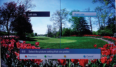
Philips' best innovation is included in all of their TVs larger than 27 inches. A series of picture choices called the Settings Assistant helps users adjust the picture quality to their room conditions and preferences. I tested the 32PFL7332D 32-inch LCD. I had some confusion with the first screen, which asks your location, Home or Shop. (Choose Home; Shop is for setting up the TV as a store demo.) After that, the rest of the Settings Assistant was not only useful but fun. The first screen was a picture of a butterfly split down the center, followed by images of penguins, people, a golf course, and a canyon. The left and right sides of each picture display different settings. You simply pick the side you prefer. It was obvious to me that I was choosing black level, tint, contrast, sharpness, etc., but the Settings Assistant never asked me anything more than which side I liked. To navigate through the Settings Assistant, there is a green bubble for Next, red for Previous, and blue to Cancel, each corresponding to a colored button on the remote. After the picture settings, you can choose between two settings of audio and (for this model) Ambilight. Voilà! You've set up your TV with a picture that is perfect for you without ever going into a picture menu.
Beauty and Simplicity
I'd seen Pioneer's plasma with the Home Media Gallery and wondered if it was easy to set up. So, I requested a PRO-940HD, and what I found surprised me. While Pioneer is well known for their dedication to picture quality, right away, I spotted signs of simplicity. The remote's buttons had large numbers, and the aspect-ratio button was labeled in plain English "screen size" in a font twice the size of that on a typical remote button. The layout was clean, and there was direct access to each video input, including labels for "PC" and "ANT." Hidden behind a flip cover to prevent confusion are buttons to control other devices, the remote switch to control other components, and buttons for advanced commands. The simplification continues with the onscreen menus. I never had to guess which setting to use or how to use it. When I highlighted "Tint," for example, instructions appeared at the bottom of the menu that read, "Adjust the color tint (arrows left and right). Adjust to the skintone that looks best." To set up the channels, I chose Tuner Adjustment, which brought up a menu bar where I could choose my favorite channels or pick Channel Setup. I chose Channel Setup, and instructions appeared to the right: "To modify channel settings for antenna A, press Enter." It led me step by step to the end of the setup. More kudos go to the owner's manual. I found everything I needed in the table of contents, which made it OK that the manual didn't have an index. It also made up for the manual's organization, which seemed a bit arbitrary.
Philips Settings Assistant
Note that Pioneer's top-of-the-line PRO-FHD1 remote is further pared down to a mere 17 buttons. This level of simplicity in so many areas was obviously well planned. I was excited to speak with Chris Walker, who is in charge of Pioneer's Worldwide User Interface Project for standardizing the remote and menu user interfaces of all Pioneer products, coordinating efforts with Pioneer Europe and Pioneer Japan. He explained that, not only do they focus on incredible picture quality, they understand that using their products can be a confusing experience for the consumer. Bravo!
Minimal TV Remotes
It's almost a cliché to say that remotes need to be easier to use. Both Philips and Pioneer have made great advances in this area. Hitachi is doing their part by supplying two remotes with their Director's Series TVs. One remote is standard-size, with thumb wheels for volume and channel surfing. The other fits in the palm of your hand and has only 12 buttons: five navigation buttons (which double for channel and volume buttons), Menu, Exit, Input, Mute, Favorite Channel, Guide, and Power. Clearly, this economy of buttons will be less intimidating for the nervous user who glazes over when faced with the 75 buttons on a typical remote.

Philips Menu Explanation
One Button, One Menu to Control Your Home Theater
HDMI is the industry standard in the march toward simplicity. Its single cable carries both audio and video for simpler connectivity. HDMI version 1.3 has HDMI-CEC (Consumer Electronics Control) capability. Connected components that are enabled with HDMI-CEC can detect and transmit the best sound and picture format for your system. It also lets your equipment power on, change inputs, and adjust to your preferences with a single action. Press a channel button on your remote, and the TV turns on to the antenna input. Place a DVD in the player, and the A/V receiver and TV turn on and switch to the right input.
This year, Panasonic and LG have activated HDMI-CEC in their home theater products and taken it a step further. Each remote provides a single button that brings up a home theater menu on the TV. Panasonic's third-generation EZ Sync or LG's SimpLink button both bring up a menu that will ultimately allow you to control all aspects of each device. This year, the menus are limited to changing the sound output from TV to A/V receiver and some rudimentary controls of other devices. Still, it's a movement toward unification and thus simplicity.

Pioneer Channel Menu
When All Else Fails, Call a Help Line
Manufacturers have received so many calls from confused and angry consumers that they have seen the importance of offering not just troubleshooting and repair services, but help in setting up and using their products. Earlier support centers would only help you with gear made by their own company, but most will now help you connect any manufacturer's equipment to your new TV. However, they may not tell you which type of connection is best. Panasonic offers their plasma customers a VIP customer number they call Plasma Concierge. Hitachi prides themselves on their award-winning toll-free support number. And Philips backs up their simplicity with excellent phone support. While there is room for improvement, a confused customer now has someone to turn to for help.
While most manufacturers are not even out of the gate when it comes to simplifying their products, most are at least aware of the need. We now have a few strong leaders to set the example in ease of use. We finally have choices of TVs that are not only simple, but will also deliver quality video. Later this year, manufacturers will release simplified DVD players and A/V receivers. All in all, these products will make our viewing experiences easier, but, more importantly, they make new home theater features accessible to users who have found technology too complicated to tackle.
- Log in or register to post comments


