Sling TV Gets New User Interface on its First Anniversary

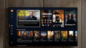
A familiar cover art grid replaces the carousel of channels and TV shows, The home screen is the “MY TV” view that will display the user’s most viewed channels and shows as well as recently watched shows, and recommended content. Across the top of the screen, a user can quickly access a grid guide (similar to that of a Dish schedule), TV shows, movies, and sports categories.
The TV Shows view displays all of the currently availably episode of a particular show so a user can find and play their desired episode. The Movies view brings together titles from live, linear and on-demand and will be labeled as free or priced for rent or purchase. The Sports view lets the viewer specify a specific sport or team and will display live and upcoming events.
The My TV user interface will roll out in the first quarter of 2016. What’s more exciting is the personalization and recommendations that will roll out over the coming year. In future updates, the menu will change as it “gets to know” an individual’s viewing preferences. It does this not only through the shows and movies a user has watched previously but at what time of day he watched certain titles, and whether the show was viewed on the Sling TV app on a TV at home, or on a mobile device while away. For example, a viewer may always watch cooking shows on the food channel in the late afternoon at home, or watch sports on the weekends on a tablet. The Sling TV will then recommend other shows to watch at specific times of day or days of the week.
Sling TV will continue its base service at $20 per month with the ability to skip months and start again. Packages for extended sports, entertainment, or family channels start at an additional $5, and HBO Now is $15 per month.
- Log in or register to post comments


