Sony KDL-55XBR8 LCD TV User Interface
 User Interface
Like virtually all TVs these days, this one has a universal-type remote that can control up to four devices including the TV. It's fully illuminated, though some of the labels are on the remote body instead of the buttons themselves, so you can't see them in the dark even with the backlight on.
The layout is reasonably good, with well-separated buttons. The number, volume up/down, and channel buttons are nice and large, but the transport and some function buttons are pretty small. Tightly surrounding the central cursor control are five curved buttons that access the menu, call up a list of inputs, open TV Guide On Screen, and manage your favorite channels, inputs, and photo and music content. I thought the proximity of these buttons to the cursor controls might lead to unintended actions, but it didn't during the review period.
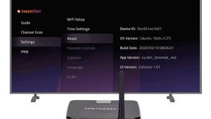
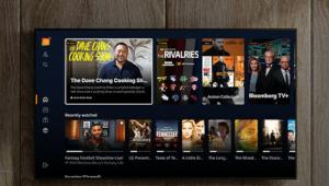
The menu system is based on Sony's XrossMediaBar (XMB) design, in which main menu items are arranged horizontally and their submenus branch off vertically from each one. The more I work with the XMB, the less I like it. In this set, there are five main menu items—Settings, Photos, Music, TV Channels, and External Inputs. I see absolutely no reason to have channels and inputs in the menu at all, since a list of the inputs can be called up with the Input button on the remote, and channels can be entered on the numeric keypad. Also, there are many submenus under Settings menu that could be reorganized into logical groups at the main level.
Unavailable menu items are grayed out, but the cursor stops at each one instead of skipping them as it should. Also, when you reach one end of a list, you can't continue in the same direction and go "around the horn" to the other end. Many times, I found myself wishing I could jump from the beginning to the end of a list without having to scroll all the way through it.
Another pisser is the lack of an Exit button, which would jump out of the menu system immediately. As it is, the fastest way out of the menu system is to press the Home Menu button twice.
Every time you enter the XMB, the channel list is selected, not the place you were when you last exited the menu. At least it returns to the submenu you left when you scroll back to the Settings menu, which is better than returning to same item every time. However, I would much prefer it if you returned directly to that item when re-entering the menu system.
Accessing the basic picture controls through the main menu takes at least seven button pushes. You can get to these controls a bit quicker by pressing the Options button, which brings up a menu of commonly used submenus, including the picture controls. However, to access the frame-interpolation and film-mode settings, you must go through the entire XMB.
Speaking of the frame-interpolation and film-mode settings, these are found in separate submenus from the rest of the picture controls. This seems very clunky to me—why can't these settings be in the main picture menu and adjusted for each input there rather than in a separate submenu?
- Log in or register to post comments
