The S+V Interview: Devolver Digital's Nigel Lowrie Talks Hotline Miami Page 2
What are the limitations of working within the retro aesthetic? It's a lot more technologically advanced than an original Nintendo game but still has that overall feel.
There're fewer limits. When you're shooting for more realistic visuals that puts a lot more limits in because a lot more is expected. If you have an emotion you want to convey, you're expected to convey it through voice acting and complex 3D imagery. You can pull it off sometimes, but many times, you can't because there's limitations to technology. If you go back to a base art form like pixel art, it's like going back to radio versus TV. You still have to convey the same emotion but you have to do so in a smarter way, a simpler way but you're given a lot more room to do whatever you want with it.
For example, when you're in a game that's trying to evoke a lot of mystery [our art style] helps; we fudge the camera a bit so you don't have to give every little detail away. Anything you put in via text has a lot more power and you don't have to play it out in cutscenes or 3D animated scenes. It allows you to be a little more over-the-top without being gory for the sake of gore.
It's a very violent game and you're going to walk up to someone and slit their throat. There's been cases where there's been a fire axe and with one swing, you'll lop off a head and arm and the person dies. If you do that in a realistic game, it's a lot more off-putting and feels like gore for gore's sake. In Hotline, it's disgusting to think about in your mind's eye, but not to look at this little character spurting blood across the screen. You still accomplish this idea of a very violent act without disgusting somebody.
You could almost say it plays into the aspect of your mind filling in the actual visuals. Most horror movies fall apart once you see the monster because what you're expecting to see doesn't live up to what your eye is seeing.
Exactly, the original Alien was a lot scarier when something was creeping around and you weren't sure what it was. Then you see what it was and it freaks you out, but it plays a lot cooler when your mind has to fill in the blanks.
You talked about never seeing the character's face. There's a lot of symbolism with that. You don't see that character's eyes so you can't establish trust that way. That was something Coppola did with The Godfather. In the opening shot of the first movie when the camera is panning, you can't see Brando's eyes because they're obscured in shadow; it's a psychological thing.
Yeah, it's weird to sometimes say that. Since we announced the game, when we put out video or screens or interviews with the developer - because a lot of gamers have become jaded about the violence - people automatically will dismiss the game based on the violence. Once you play Hotline Miami, you understand it's not trying to be something like Thrill Kill - wait. . . that game never came out - but something that's trying to ratchet up the violence just for violence's sake.
Soldier of Fortune did that, where it had four or five different levels of how the gore would detect where bullets went in.
Soldier of Fortune was a fine enough game, but that was a one-trick pony. It was one of the first games where you could shoot off arms and then continue to shoot a body apart once it was on the ground. That was fine for a few levels, but I remember moving onto something else that, gameplay-mechanic-wise, was more interesting.
What I really noticed with Hotline, even within the first 30 seconds, is that it's really unsettling. It conveys that emotion very well even with the limited technology. It's almost like the game has to work harder as a result. I remember around the time when Grand Theft Auto: Chinatown Wars was released on the Nintendo DS, Leigh Alexander tweeted something along the lines of "Rockstar is at their best when they have severe limits in place." I got that feeling from Hotline. Because of the constraints, it forces the developer to be more disciplined in what it's doing.
At Devolver, we work with a lot of smaller independent developers. Because Dennaton isn't focused on making 3D panoramas or cinematics, the gameplay has to be extremely fun. We're working with developer Vlambeer on their game Luftrausers and it's an old-school World War II dogfighting arcade game, it had very stylized but very simple graphics, much like Hotline Miami. I was playing it for maybe two hours last night, and just looking at it it doesn't look like much, but the gameplay is so tight and so perfect it's fun to play.
You have a million games coming out this year and next year and a lot of them are fantastic to look at, but they're not very fun to play. We have ways to track who's actually finishing our games with how achievements are unlocked now, and maybe two percent are finishing them. It's because the gameplay isn't there to hold them; at its core [the games] aren't fun to play. They're great to look at and tour through but that will last you maybe three hours like a movie does.
I noticed the sound was really scratchy and blown out. It sounded like my speakers were blown. How hard was it to tie that into the aesthetic? It adds to the feel and there's almost a dissonant sound pattern that adds to the unease.
There's a couple different things. The soundtrack itself was all licensed music the developer went out and found because [the songs] have a very '80s vibe to them, but some of it is very grimy like you said. The scenes when you're interacting with the masked characters, the music has a really harsh sound. If I had to sum it up in one word, the game makes you feel very uncomfortable.
The constant flashing of the areas outside of where the actions is taking place adds a lot to that, too.
Exactly. The music was chosen so when you're battling there's crazy upbeat music playing. But, when you're not in the midst of battle, like in the in-between scenes or you're in your apartment or the pizzeria there's uncomfortable music playing. It's very cool, but it has some very harsh sounds that come into play.
The sound effects in the final game were redone so they fit the mood a little more by a guy by the name of Jordan Fehr, who did the sound for Super Meat Boy. He did original sounds for the gunshots, doors opening, your car door slamming shut because the team wasn't happy with the generic sounds you can buy online.
With Retro City Rampage, Super Brothers: Swords and Sworcery, and de-makes, is the market for these retro-styled games limited to those with a nostalgia penchant?
No. Retro City Rampage, Super Meat Boy or Swords and Sorcery all use pixel art but all have wildly different gameplay. It's deciding if you want to make an action movie or a comedy, are you going to shoot this in color or black and white? Are you going to have heavy saturation or shoot it in 3D? The [visual style choice] is separate from the game you design. You can choose to mix and match those, but the within the art style itself, there isn't any limitation.
A de-make itself is you take a popular game and breaking it down to 8-bit stuff, yeah that gets a little old because it's just Oh wow, look at Master Chief but now he's just 8-bit. That's neat, but that's not a game itself. If you choose an art style, it's one thing to choose a gameplay style that's another. You mesh those up and I don't think there's any limitation there.
It's refreshing to see the modern takes on the classics. I really like the LittleBigPlanet series because it's a 2D platformer. I cut my teeth on Super Mario Bros. so that series really works for me. Seeing new stuff like Hotline come out really scratches that retro itch for me.
The idea of getting my NES out, hoping it works and the frustrations involved with that combined with the fact that technologically those games haven't aged that well. I don't have eight hours in a sitting to play from beginning to the end.
We talked about people who like the classics, but you'd be surprised at how really disinterested people are at this moment playing or completing [them by playing] from beginning to the end. Games like we're talking about that have that same aesthetic and same feel but are new games that layer in what the medium has learned as a whole over time to help play smoother makes for a much better experience.
Super Mario World is one of my favorite games of all time, but I'm not going to play through it again, I've played through it before. It's aged rather well compared to old Nintendo games, but I love re-experiencing the 2D platformer like you said with LittleBigPlanet or what Nintendo is doing now with the New Super Mario Bros. series, they're great.
What are the traps you have to be aware of when you're designing a retro-styled game?
Relying on nostalgia, looking at and saying you love pixel art and falling back on that alone - it's not going to get you a good game today. There's a lot of people who can make a retro game. You can go on any of these freeware sites and find a million projects in place that are retro-styled games, but that alone isn't going to make it a good game: it's not a new idea. You have to have a gameplay hook or gameplay mechanic that's new and different.
Any kind of game you're making has the same sort of pitfalls. It's Super Mario World but now you're playing as conjoined Siamese twins. That better have a gameplay hook, it better not just be swapping out the graphics but is still the same thing. Make the Siamese twins do something that's unique and interesting, not just a clone. We get pitched games all the time that have a retro vibe to them, but you find there's nothing new here; they don't advance games or the genre one bit or try something new and brave.
What's with the character in Hotline Miami that gives out all the free food? Who is he? Does he have a hard time holding down a steady job? Is he massively in love with crappy clerk jobs?
Well yeah, maybe! (Laughs) We need someone to fill all these jobs and that guy is literally filling all these jobs. He's the 99%, he's gotta work hard for his money. He's got a couple different places he works around town. The character is modeled after one of the guys that did music and put together the launch trailer. They decided to keep the exact same guy working at every place instead of making a new character and it gives the game a nice bit of consistency because he always recognizes the player. He's the hardest workin' man in all of Miami!
What's with the weird marketing trailers for Hotline? They almost remind me of the Nicholas Cage flick "8MM." They get under your skin.
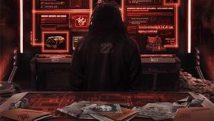
We released gameplay trailers and the live action one, "Wear Something Fancy." The launch trailer was built on the feeling of uncomfortableness. I worked closely with the guys to come up with the concept for these two trailers. "Wear Something Fancy" is based around the idea of seeing the character enter his apartment and take a message. Every time you come back to that apartment something is different, something has changed. You go off, do these violent acts, and then come back to the apartment. It was taking that little slice of going up to that answering machine; it's playing up that uncomfortable feeling the character's getting of having to go do something.
Something you do in the game that you take for granted and do 20 times; we want to take that moment and have you realize what's going on and why that person's taking a pig mask and listening to this message and going to do this violent act. We wanted to plant this feeling that's really grimy and ratchet that up. Violent things are happening, but the character is very unhappy about it, yet he goes through with them anyway; this is a major theme in the game. We wanted to bring that through in the marketing.
It's built around that phone line and we actually setup a phone number to call for that.
I did that. I left a message saying I'd drown them in their blood and got a text message back that was equally, if not more so, disturbing.
That plays into the exact same thing. Every element we wanted to do plays into that and it's not holding back.
- Log in or register to post comments


