Sony KDL-52XBR4 LCD TV User Interface
 User Interface
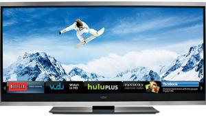
The menu system is based on Sony’s new XrossMediaBar (XMB) design, in which main menu items are arranged horizontally and their submenus branch off vertically from each one. I like the concept, but this implementation is less than ideal. For one thing, there are only three main menu items—Settings, TV Channels, and External Inputs—and I see absolutely no reason to have channels and inputs in the menu at all, since a list of the inputs can be called up with the Input button on the remote and channels can be entered on the numeric keypad. Instead, I’d much rather see the Settings submenus reorganized into logical groups that could be accessed from the main level.
Unavailable menu items are grayed out, but the cursor stops at each one instead of skipping them as it should. Also, when you reach one end of a list, you can't continue in the same direction and go "around the horn" to the other end. Many times, I found myself wishing I could jump from the beginning to the end of a list without having to scroll all the way through it.
Every time you enter the XMB, the channel list is selected, not the place you were when you last exited the menu. At least it returns to the submenu you left when you scroll back to the Settings menu, which is better than returning to same item every time. However, I would much prefer it if you returned directly to that item when re-entering the menu system.
The illuminated remote is a universal type that can control up to three devices other than the TV. The button layout is fairly well-organized, but a few of the labels are printed on the body and so can't be seen in the dark, even when the blue backlight is on.
Fortunately, the main picture controls can be called up immediately with the Options button without having to navigate through the XMB. Direct-access buttons to the sound, picture, and aspect-ratio modes are a big help as well, though I wish the remote also offered direct-access buttons for the inputs.
- Log in or register to post comments

