Just think the power one person can have in their hand. Televisions, DVD Players and other devices could be controlled flawlessly and without much effort. No longer looking at small printed numbers (Sometimes looking like foreign print) wondering which code in a Universal Remote may turn off the TV but not control Menu Button. Put away the magnifying glass as the last remote you will ever need is here.. Wait is this a dream...Was I dreaming or is it really here..We must wait to find out...
Logitech Harmony One Universal Remote User Interface
 User Interface
As I mentioned at the outset, the Harmony One is the result of extensive ergonomic research in which all aspects of the remote's design and operation were carefully considered. The casing is contoured to fit very well in the hand, the underside is slightly rubberized to make it feel secure, and the weight is well-balanced for one-handed operation.
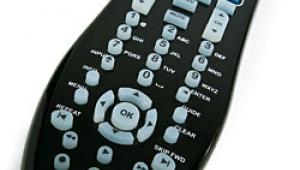
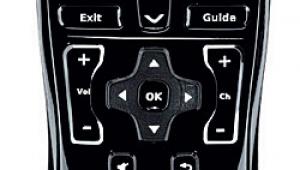
The One uses mostly physical buttons instead of a large touchscreen, though it does have a small touchscreen that I'll discuss shortly. In general, I don't like large touchscreen-based remotes—you must look at them to find the button you want to press, which takes your attention away from the video screen. According to Logitech's research, this is generally annoying, and I certainly agree. A remote with mostly physical buttons can be operated by feel in the dark once you learn the layout.
Speaking of which, the button layout is exceptional—each functional group, such as transport controls, menu/cursor/enter, channel/volume/mute, and so on, are logically organized. Even better, each button has a different shape and feel—for example, the Play button is convex and the Pause button is concave—and the buttons are physically separated from each other, all of which makes them very easy to find by feel.
The touchscreen is relatively small at the top of the remote and in full color. The screen displays up to three Activity buttons (Watch TV, Listen to CD, etc.), and more can be accessed in different onscreen "pages." Logitech's research clearly indicates that most people engage in only three entertainment activities most of the time, which is why there are three activities per page—most folks will probably never need a second page at all.
Once you select an activity, the screen displays device-specific buttons, such as the TiVo and Thumbs Up/Down buttons for a TiVo DVR, and there can be several pages of these controls. You can also choose different "themes" (colors, fonts, icons), add icons to customize the onscreen buttons, and even display a slide show of up to eight digital photos in the screen, though I don't really see much value in that.
More importantly, the touchscreen uses a new technology that makes it much more sensitive than conventional touchscreens. The active coating is on the inside surface of the screen, and it senses tiny electrical changes in the fingertips rather than capacitance. All of this makes it much easier to manipulate with large fingers.
Even the backlighting is well-designed. It's activated by a motion sensor, and it illuminates labels on the buttons themselves. The overall effect is very elegant and not too bright.
- Log in or register to post comments

