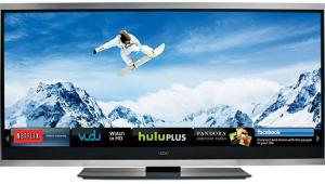
Vizio VF550XVT LCD TV User Interface
 User Interface
The universal remote is the same as the one included with the Vizio VP505XVT plasma TV. It's relatively large with a nicely rubberized underbelly, and it can control up to four devices including the TV. The buttons are well-separated but rather small and mostly the same size and shape. The labels are on the buttons themselves, making them identifiable in the dark when the backlight is on, though a few have multiple functions, and the secondary labels are on the body of the remote with no illumination.
Unlike virtually all other TV remotes, this one has dedicated input-selection buttons—sort of. Actually, each type of input has its own button; for example, the single HDMI button cycles through the five HDMI inputs by pressing it repeatedly. Still, this is far better than the usual single button that cycles through all inputs or calls up an onscreen list.
I don't like the menu system nearly as well as the one provided by the VP505XVT. The first level has only the major categories, and you can't see the parameters in the selected category except the picture and audio preset modes, and then only when the category is highlighted. The basic parameters are found in the second level, but again, you can see only the value that is highlighted.
Finally, and most importantly, when adjusting a picture control, it does not drop to the bottom of the screen and the rest of the menu does not disappear, obscuring the image you're trying to tweak. Why couldn't Vizio simply implement the same menu system as in the VP505XVT?
- Log in or register to post comments
