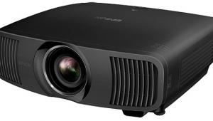
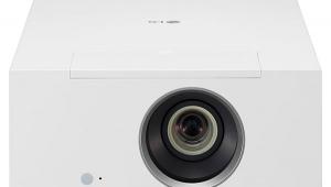
Epson PowerLite Home Cinema 8350 LCD Projector

I've always liked Epson projectors—they generally produce an excellent picture for a reasonable price, which makes them a great value. The PowerLite Home Cinema 8350 is no exception, though it's not quite the home run that Epson's UB (ultra-black) models are. In fact, my primary complaint with the 8350 is its not-so-great blacks, which isn't helped much by the dynamic iris on real-world material. Granted, its blacks are better than those of the Optoma HD20, but they're still too bright to achieve a really great picture, especially in dark scenes. Also, colors are not spot-on accurate with this Epson, though I didn't find that bothersome when watching Blu-rays, DVDs, and TV programming. Another surprise—despite color fringing and softness I saw in certain test patterns, the detail in real-world content was quite good, if just a tad softer than the DLP-based HD20.
Features
Based on 3LCD technology—which uses a small, separate LCD panel for each primary color (red, green, and blue)—the PowerLite Home Cinema 8350 is Epson's least-expensive 1080p projector. It provides a dynamic iris that automatically opens and closes depending on the overall brightness of the image, which increases the measurable peak-contrast ratio dramatically. However, even on the high-speed setting, it takes a few moments to adjust itself, which can be easily seen in some scenes. Also, since the overall brightness of many movies often changes quickly, the practical effect is less dramatic than when looking at solid white and black fields in isolation for contrast-ratio measurements. This is why I normally leave any dynamic iris off, as I did in this case.
Geeky calibration controls include 2-point grayscale and a complete color-management system (CMS), neither of which should be adjusted by anyone without the right equipment and training. However, users can play with the gamma settings, including several presets and a customizable gamma curve. Gamma determines how much light the projector outputs as the image changes from black to white—if the amount of light increases too slowly, you won't see low-level details in dark scenes, but if it increases to quickly, the image will looked washed out. If you screw up the picture, you can always hit the reset button or select one of the preset gamma settings.

I really like that the 8350 has 10 memory locations that can store all the settings. This let me store different configurations and compare them quickly. Another cool feature is an overscan control that lets you eliminate overscan, which slightly enlarges and then crops the image to eliminate the "digital hash" that sometimes appears at the top edge of some broadcast channels. However, this also degrades the detail of the image, so I much prefer to live with digital hash and disable overscan in order to maximize detail.
Ergonomics
The remote's layout is excellent, with large, well-separated buttons with labels on them that can be seen when illuminated. As with most projector remotes, there are dedicated buttons to select the input and access several functions, which I always appreciate.
Likewise, the menu system is very well organized. It opens directly into the Image menu with the picture controls visible, though I wish it opened into the previously selected menu. I was delighted to discover that the menu stays on the screen until you exit, which makes adjustments far easier than a menu that times out after some period of inactivity. As usual, when you select a picture control, it drops to the bottom of the screen and the rest of the menu disappears, but you can't cycle through the controls at this level—you have to back out one level and select the next control, which is a bit cumbersome.
Setup
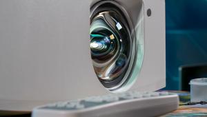
The 8350 provides manual focus and zoom as well as horizontal and vertical lens shift, making placement and alignment with the screen easy and flexible. The lens-shift thumbwheels have a lot of loose play, but I was able to align the image on the screen without much trouble. To help in that process, the projector offers an internally generated crosshatch pattern of white lines on a blue background. However, looking closely at that pattern, I saw fairly pronounced color fringing around the white lines, especially on the vertical lines, and even at the best focus setting, the lines did not appear sharply in focus.
- Log in or register to post comments

