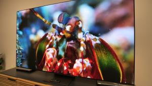
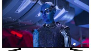
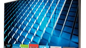
Vizio M601d-A3R 3D LCD HDTV

AT A GLANCE
Plus
Great contrast and screen uniformity
Good looks
Decent set of streaming options
Minus
Slightly inaccurate color
Unimpressive 3D performance
THE VERDICT
Vizio’s 60-incher combines very good value with above-average picture quality.
With the CES in the rearview mirror, it’s time to look ahead to the new TVs that 2014 will bring. Hold on: Was there something we missed as 2013 wound down? Sound & Vision lavished loads of attention on OLED, 4K, and other high-priced TV options in 2013, but what about the budget category? Anything happen there worth looking at?
 We recently posted a review of Toshiba’s 58L7300U LCD HDTV, an impressive, no-frills 2013 set that’s still available and selling at a very reasonable price. Now here’s Vizio’s M601d-A3R, a model that started shipping in late 2013 with a slightly larger screen than the Toshiba’s—and a slightly higher price tag. The Vizio does the Toshiba one better by including passive 3D, though it’s scheduled to be replaced later this year by a refreshed M-series shown at CES that uses a more advanced full array, local-dimming LED backlight, as opposed to the edge-lit backlight used for 2013. But while it remains available, let’s see how it fares.
Besides passive 3D (with four pair of glasses), Vizio’s features for its M Series 60-incher include built-in Wi-Fi, a 240-hertz refresh rate, and the aforementioned edge-lit LED backlight with “Smart Dimming.” On the M601d-A3R, Smart Dimming utilizes 16 LED zones and can auto-detect letterboxed content, shutting off the backlight in specific zones where black bars appear to ensure consistent blackness.
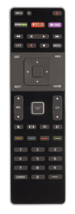
 The physical appearance of the M601d-A3R is the best I’ve seen to date in a Vizio TV. Its screen is bordered by a thin (0.4-inch) bezel and edged with a metal-toned strip. The stand has a small footprint, yet it’s impressively sturdy due to a die-cast metal neck that props up the panel. Vizio’s remote control has a backlit keypad and a button layout that’s easy to deal with. A cursor pad near the center contains navigation controls, while a strip of buttons located at the top let you jump quickly to Netflix and Amazon Instant Video.
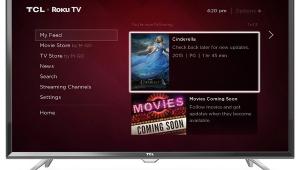
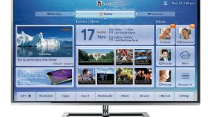
Pressing a large button emblazoned with a “V” at the remote’s physical center calls up the set’s app launcher, a horizontal strip showing seven apps that you can scroll through and select with the remote’s cursor controls. Options here include popular ones like Netflix, Amazon Instant, Vudu, Hulu Plus, and YouTube. Other choices include Pandora, Rhapsody, Flickr, Twitter, and Facebook. Hitting the big V twice calls up a My Apps full-screen menu. From here you can browse apps by category, as well as add or delete them from the My Apps page.
During initial setup of the TV, onscreen prompts guide you through the process of pairing the remote with connected sources like a Blu-ray player and a DVR. My first attempt at pairing an Oppo BD player and TiVo with the remote failed. After I performed a factory reset of both the remote and the TV, however, the pairing process worked for both devices and I was able to control them easily, though I found the Vizio remote to be an inadequate substitute for TiVo’s clicker.
Setup
The M601d-A3R has multiple picture presets to select from, including Calibrated and Calibrated Dark modes. Default brightness in Calibrated mode was a bit over-the-top at 80 foot-lamberts, so instead I selected Calibrated Dark, which at 35 ft-L was a better option for low-light viewing.
 The set’s gray scale displayed a red emphasis with the Calibrated Dark mode’s default Normal color temperature selected—something that could be remedied easily by making adjustments to the set’s RGB Gain and Offset controls. The primary and secondary color points were for the most part accurate, with only red measuring notably off-target. Unfortunately, Vizio doesn’t provide color-management system adjustments, so there was no way to fix the set’s red rendition.
One must-set option in the Vizio’s Advanced picture menu is Smart Dimming. When this was enabled, contrast ratio checked in at a very impressive 36,030:1. When it was switched off, contrast ratio dropped down to 4,848:1, making black tones look more of a dark gray. A number of uniformity issues also showed up with Smart Dimming off, including corner spotlights and screen clouding. These were clearly visible on both test patterns and regular programs, though they magically disappeared when I turned Smart Dimming on.
Along with color-management system adjustments, one other advanced setting that’s missing from the Vizio’s picture menu is gamma presets. In the Calibrated Dark mode with Smart Dimming on, the M601d-A3R’s gamma averaged out to 1.9, dipping as low as 1.6 at 80 percent white. Translated into English, that means that even in Calibrated Dark, the M601d-A3R’s default gamma is better suited for viewing images in a well-lit room, rather than a dim or dark one.
- Log in or register to post comments

