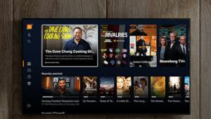
Google TV's latest upgrade enhances the streaming experience with a more intuitive interface, faster performance, and better content recommendations. It's a game changer for smart TV users, making content discovery seamless while optimizing streaming quality. A must-have for anyone looking to upgrade their entertainment setup! Another way to have fun is to play Flappy Bird
Stream Smarter: Google TV Streamer’s Powerful Upgrade
AT A GLANCE
Plus
4K Dolby Vision and Dolby Atmos
Spot-on content suggestions
Continue watching from the home screen on most apps
Remote control finder
Minus
Push-to-talk remote for voice commands
No dedicated Play button on the remote
Not WiFi 6 capable
The library menu is poorly designed
The Verdict
The Google TV Streamer’s faster processor provides improved sound and video quality, making it a solid performer. But what really sets this streamer apart is its excellent home screen content suggestions, personalized using AI to analyze your Google activity for the perfect recommendations.
Introduction
With the launch of the Google TV Streamer this fall, the company also announced that it will be discontinuing all Chromecast products, including the Chromecast 4K with Google TV. The Chromecasts will be sold until the stock runs out (which could take years, so there’s no need to worry if you still want one).
While the Google TV Streamer interface is nearly identical to that of the Chromecast 4K with Google TV, the new Streamer has upgraded its processor, memory, and storage. It has 8 GB of RAM, whereas the Chromecast 4K has 4 GB, and 32 GB of storage versus only 8 GB in its predecessor.
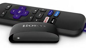
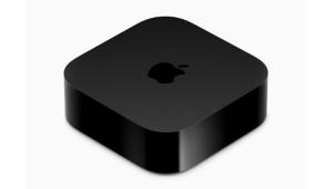
The improved hardware brings its performance up to the level of its closest competitor, the Roku Ultra (although the Ultra also got a performance boost in this year’s model). Even though it’s not as powerful as the Apple TV 4K, which has 128 GB of storage, it costs 30% less than Apple's device.
Features
The Google TV Streamer’s improved processor and RAM allow for smoother navigation and faster video playback in apps, with minimal buffering. More memory means that users can download more apps and larger games to the device.
Like the Roku Ultra and Apple TV 4K, the Google TV Streamer offers Dolby Vision, HDR10+, and Dolby Atmos sound to provide the best audio and video experience.
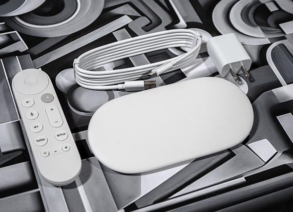
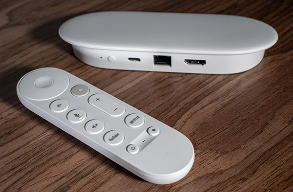
The Streamer has abandoned the dongle form factor, emerging from behind the TV in a sleek, oval, angled design. It sits unobtrusively on or in a media center, with no display or lights on the front. It comes in white or hazel (gray).
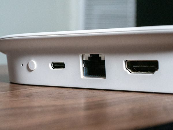
Unlike Chromecasts, the Streamer has an Ethernet connection. This not only ensures a stable connection but also strengthens the signal when it’s used as a Matter Hub with other compatible smart home products. The port also compensates for the Streamer only having WiFi 5, not WiFi 6 like the Apple TV or Roku Ultra.
While the Streamer’s hardware has been updated for better-quality sound and video, its user interface and recommendations surpass its peers. Google AI uses data from Google searches, YouTube play history, and other Google data to personalize content suggestions. Suggestions are displayed at the top of the For You home page.
Google AI also generates an accurate synopsis for each movie and TV episode details page and gathers title review information. Reviews are from regular audience members who post their opinions on Google. The page also lists a Rotten Tomatoes rating and summarizes reviews from critics and popular websites, with QR codes linking to the original reviews.
The user interface has been simplified to include only four tabs—For You, Live (TV), Apps, and Library. The Live TV tab displays a customizable schedule grid that includes 159 Google TV Freeplay Channels and free channels from Tubi, PLEX, Pluto TV, Haystack, and more. Categorized live TV grids group channels into Movies, Local News, Hit TV Shows, Reality, Sports, Crime, Classic TV, and more. You can also choose your favorite channels, which the Streamer will display in your Favorites guide. The separate guides make it much easier to find the type of content you are in the mood for.
For those who find the main For You home screen too cluttered, the Apps screen displays your apps and makes it easy to browse for new apps in the Google Play Store by category. The Apps screen also lists apps you have on other devices and might want on the Google TV.
Movies purchased from Google Play, those in your Movies Anywhere library, or titles you’ve redeemed from DVD and Blu-Ray digital codes also appear in the Library view. This tab is where you’ll find titles added to your watchlist from various apps.
Like all Chromecasts and Google TVs, the Google TV Streamer can cast content from mobile devices.
Performance
I first noticed that the crisp, clear picture quality is on par with my go-to streamer, the Apple TV 4K. Moody thrillers didn’t go black when I viewed them during the day, as I could see shadow details, and colors were rich and saturated. While I’ve had issues seeing details in the shadows with other streamers, the second season opener of Silo, where the lead character was wandering without light, was easy to see.
My biggest “problem” with the Google TV Streamer was that the recommendations on the home screen were so good that I never went straight to the video I had planned on watching. One of the suggestions—either another movie, TV title, or YouTube video—would capture my interest, and I’d watch it first. The subjects related to content I had recently watched or searched for on Google. Last week, I had been photographing king tides on the coast and searching for tide information. Since I often search for photography, Gemini put it together and showed videos on how to photograph king tides, even though I hadn’t searched for that specific subject.
Navigation was not only smooth but also had almost no lag when clicking on a suggested show or continuing to watch a title from the home menu. I would click on the title, and within seconds, it would open the app and start playing the video with no noticeable buffering. Search results were immediate and complete, including all the ways to watch the title.
The user interface screens are mostly easy to navigate, but the library page needs redesigning. It consists of a carousel row of movies you own, followed by a carousel of your watchlist. If you own a lot of movies or have added a lot of titles to the watchlist, it’s tedious to scroll through (although scrolling can be so fast that you miss the title you are seeking). A grid that displays more titles at once and is alphabetized with links to jump to a letter would be much better.
And while the For You page displays excellent suggestions on the first screen, it’s busy and crowded. Much of the top of the first screen is taken up by ads for new releases, with the Top for You suggestions in front of them. What makes it look most chaotic is that there is a row of square icons followed by circle app icons, and each row has different cover art sizes.
Hovering over a title on the For You page shows a caption that includes the title, price, app, where to watch it, and the Rotten Tomatoes score. Clicking on the cover art plays a trailer and brings up a useful details page with an AI-generated synopsis, “What it’s about,” “What people are saying,” and for kid’s titles, “What to know” advisories for sensitive young children. The Wild Robot gets a 97% Rotten Tomatoes rating. Below the summary of reviews is a sampling of audience reviews calling the film life-affirming, with links to full reviews. Warnings include a gosling who has lost its parents and needs to learn how to survive.
For a bit of fun, you can use AI to generate art for screensavers. Go to the settings panel to start screensavers, then arrow down, choose Custom AI Art, and pick Create New. I let my imagination go wild and asked for “corgis on motorcycles near the coast,” “a sloth in samurai clothes,” and “fairies near Multnomah Falls.” I get a chuckle whenever the screensaver is playing.
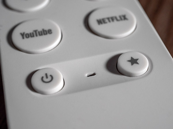
I am not a fan of the updated remote control and voice commands. It still uses AA batteries, whereas other remotes are all rechargeable. The volume buttons have been moved from the side to the front of the remote, making it bigger. Like the Chromecast 4K remote, the center of the navigation wheel is all-purpose. Not only does it serve as the action button (OK, enter, return), but it is also the play/pause button. While I was ultimately able to get used to the volume and play button, it still doesn’t feel natural, and I have to think about the play button. I would prefer it to be separated.
 br
One nice feature of the remote is it gives you a programmable button that you can assign to the app of your choice.
You need to press the microphone to use voice control. Once I pick up the remote, it’s easier to navigate to a title or press play rather than say a command. The Google TV Streamer reacted to a few voice commands I gave to my Google speaker. It would bring up a title on the Google TV Streamer but wouldn’t play it even with a Play command. The “play” and “pause” commands didn’t work despite several tries. I ended up picking up the remote to press play.
Conclusion
Using and viewing the Google TV Streamer is smooth, with streaming quality picture and sound on par with anything else on the market. If you can get past the annoying remote control, you’ll undoubtedly enjoy the benefits derived from the Gemini AI—better recommendations, summarized reviews and synopses, and customizable AI screensaver art. For anyone with an Android phone, there’s an added compatibility bonus. Chromecast has long had one of the best user interfaces, and Google TV Streamer adds some of the best audio and video. It’s a solid choice.
Specifications
Dimensions: Length 6.4 in, Width 3 in, Height 1 in
Resolution: 4K, HDR, 60 fps
Video Formats: Dolby Vision, HDR10, HDR10+, HLG
Audio Formats: Dolby Digital, Dolby Digital Plus, Dolby Atmos
Connectivity: WiFi 802.11ac (WiFi 5)
RAM Memory: 8 GB
Storage: 32 GB
Ports: USB-C, HDMI 2.1, Ethernet (10/100/1000 Mbps)
Smart Home: Matter, Thread border router
For full specs click here to go to Google's official page.
- Log in or register to post comments


I recently discovered Atlyss, a unique action RPG game. The character customization system offers 5 different races and 3 classes to choose from. I love the open world exploration and the real-time combat system. The unique art style is also very appealing. Highly recommended for RPG fans!

I've been hooked on Liar's Bar lately. It's this cool multiplayer game where you bluff your way through different bar games.

DisasterArena.Net
Thrilling multiplayer survival unblocked game. Dodge disasters, collect power-ups, outlast opponents. Solo or team play. 20M+ gameplays!

最近Gameasy.netを見つけ、ダウンロード不要ですぐにゲームができる手軽さが気に入っています。短時間のゲーム休憩に最適です!

He descubierto GeoGuesser, un juego fascinante de adivinanzas geográficas. Te desafía a identificar lugares a partir de fotos, haciendo que aprender geografía sea divertido. La interfaz es intuitiva y es completamente gratuito.

I'm impressed by the details that you have on this site.You have a good point! I completely agree with what you said!!
Thanks for sharing your views…hopefully more people will check out
Visit us:


Teen Patti (often stylized as "3 Patti")https://www.3pattibazar.com/3patticrown is a popular card game originating from the Indian subcontinent. Known for its blend of strategy and luck, it is similar to poker but tailored to the region’s culture. Over the years, various digital adaptations of Teen Patti have emerged, with platforms like 3 Patti Blue, 3 Patti Crown, 3 Patti Loot, and 3 Patti Gold offering unique experiences for players. Here's a breakdown of these versions:
3 Patti Blue
This variant is known for its clean and vibrant user interface, catering to players who prefer simplicity and speed. It provides seamless gameplay with multiple game modes, including Classic Teen Patti, Joker, and Hukam. The focus is on quick matches and a community-driven experience, with options to invite friends and join tournaments.
3 Patti Crown
Designed for players who enjoy a regal feel, 3 Patti Crown stands out with its luxurious design and royal-themed gameplay. It features high-stakes tables, exclusive rewards, and exciting side games. This version often attracts experienced players who are looking for a sophisticated yet competitive gaming environment.
3 Patti Loot
3 Patti Loot introduces a fun and adventurous twist to the traditional Teen Patti game. With its treasure-themed design, the app emphasizes rewards, bonuses, and exciting challenges. It's particularly appealing to players who enjoy unlocking achievements and participating in daily missions.
3 Patti Gold
Arguably the most famous among them, 3 Patti Gold offers a premium experience with a wide range of features. Known for its high-quality graphics, multiple game variants, and global player base, it’s a versatile platform for both casual players and seasoned enthusiasts. Its reputation for fair play and regular updates makes it a top choice for Teen Patti fans.
https://www.3pattibazar.com/3pattiloot
Each of these versions caters to a distinct audience, ensuring there's a Teen Patti platform for everyone.

I need to say goodbye to my old fireTV and go with the flow oh Google TV.
Robert from Toiture Repentigny, A family business.

Along with summarizing reviews from reviewers and well-known websites, the page also includes a Rotten Tomatoes branding in china rating and QR codes that take users to the original reviews.

Step into an adrenaline-fueled adventure that merges classic 90s shooter mechanics with contemporary innovations.
beyondcitadel

